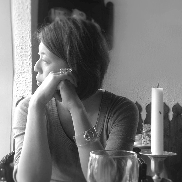
Sachiyo Fujito
PM001681
Japan / Graphic Design
Design NAP is a design office in Wakayama, Japan.
We solve business problems with wide perspective using optimal design methods and enhance your business value by designing and branding.
We provide graphic design, web design, service design.
Portfolio
-
SILMORE
SILMORE is a brand, specializing in products using Ehime Silk. The brand concept is "True yourself, with possibilities of Silk".
The name “SILMORE” is the combination of two words SILK and MORE, with our wish to spread great potentials of silk.
We produce not only clothing and towels made from silk manufactured in Ehime Prefecture, but also bath products containing silk fibroin – known as natural moisturizer delivered from cocoons.
We symbolized a cocoon and infinity symbol to express the infinite possibilities of silk.
We were involved in creating the concept, naming, logo, graphic, website, and package design, as designer. -
Manma
Clients requested us to make the color of vegetables visible, thus we choose a transparent packages and designed it very simply.
The other side of our design concept is "fashionable". This concept is aimed for removing a sense of guilt for using ready-made food from mothers but giving them "What a cute!" experience.
We were involved in creating the logo, graphic, package design, website, and as designer /consultant.
http://hatake-no-mikata.co.jp/product-list/manma/ -
Kumagusu Anpan
As a gifted person born in Wakayama, Minakata Kumagusu is also known as “The Walking Encyclopedia”, being an expert in natural history, folklore, bacteriology, astronomy, anthropology, archeology, biology, and many other fields of study.
With eccentric mannerisms and way of talking, and being far from an average person, Minakata Kumagusu leaves behind a lot of stories for the next generation.
We try to express the cutest side of Kumagusu Minakata. Thus we illustrate his portrait like a "yuru-chara" so that this appeals to girls.
http://kumagusu-anpan.com/ -
Takuramiya
Takuramiya is an education and consulting company.
They call themselves secret society. We designed their logo.
We imaged that when people are excited in plotting something, the emotion shows up through their mouth.
So we decided to use the mouth motif.
We designed this motif so simple that everybody can remember, and even draw it.
https://takuramiya.com -
LURUHALL
This is a branding project of small concert hall established in 2016. We were involved in creating the concept, naming, logo, graphic, website, and sign and service design, as designer/consultant.
Although the small hall only has 33 seats, it specializes in delivering great acoustics. The hall was designed by Masaya Uchida and is equipped with world-famous d&b sound system. Kishu-sugi cedar panel wall lines the hall, aiding the acoustics and diffuse reflection.
The name "LURU" came from the Japanese term, "RURU", meaning "continuous" or "unbroken". Keeping in mind the meaning and message of the word, the logo was drawn and designed.
http://luru.jp/hall -
Plumia
Plumia is a new type of whiskey produced with Scottish malt as base, added with Wakayama-grown produce, the Nankobai plum and Orange peelings. By blending whisky and plum, the finished-product gives off a sweet taste, accompanied by a refreshingly elegant aroma.
We produced Plumia's logo and package design. We also named it, combining the words "plum" and "premium" to give off a exquisite impression.
To visually differentiate it from other whisky or liquor, we designed the label to have an unusual shape. In addition, we adopted the plum blossom floral pattern as the logo's background as homage to the product's Japanese roots. -
UMETANI
We designed the pamphlet of a manufacturing company that produces cardboard printing equipment.
The company is able to produce high quality machinery due to an integrated production system.
In order to promote the company's history and products, we went to the factory to observe and research the production process.

